Working with Article Categories in Joomla 2.5
What is a Joomla Category?
When you write an article in Joomla 2.5, you assign it to a category. You can think of a category just like a folder. Assigning articles to categories helps not only to categorize and keep track of articles, but it also helps your website visitors find similar content based upon the category of the article they're reading. This is a standard thing to do when writing an article.
When you write an article in Joomla 2.5, you assign it to a category. You can think of a category just like a folder. Assigning articles to categories helps not only to categorize and keep track of articles, but it also helps your website visitors find similar content based upon the category of the article they're reading. This is a standard thing to do when writing an article.
Can I have Categories of Categories (Sub Categories)?
Previous versions of Joomla (ending with Joomla 1.5) used a section / category structure. What this meant was that every article belonged to a category, and every category belonged to a section. This was somewhat limiting as it would not allow for deeper categorization of content. For example, you could not have subcategories of categories. It also required that you have both a section and a category, when sometimes only a category would be needed. Newer versions of Joomla don't use the section / category structure any longer. Instead, only categories are used now, and you have the ability to created sub categories of categories if needed.
Previous versions of Joomla (ending with Joomla 1.5) used a section / category structure. What this meant was that every article belonged to a category, and every category belonged to a section. This was somewhat limiting as it would not allow for deeper categorization of content. For example, you could not have subcategories of categories. It also required that you have both a section and a category, when sometimes only a category would be needed. Newer versions of Joomla don't use the section / category structure any longer. Instead, only categories are used now, and you have the ability to created sub categories of categories if needed.
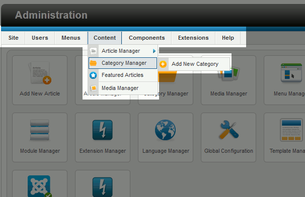
To create a new category in Joomla 2.5:
- Log into your Joomla Dashboard
- Under the Content menu, hover over Category Manager and then click Add New Category
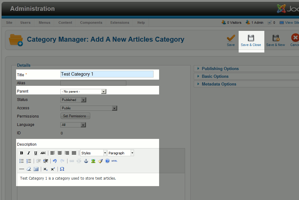
- Type in a Title for this category(this screenshot applys to the steps below as well)
- Choose a Parent Category.Is this a Parent Category?
If you would like this category to be a main category (one that is not a sub category of any other category), choose - No Parent -Is this a Sub Category?
If you would like this category to be a sub category of another category, then choose the parent category. - Type in a Description for the category (this is an optional step). This description will show when someone visits the category page (a page that will list all of the articles belonging to the category).
- Click Save & Close. You have just created a new category in Joomla 2.5!
Adding a category to Joomla does not automatically add the category to any menus on your site. If you wanted to link to this category from a Joomla 2.5 menu, you will need to add a new category menu item to the menu of your choice.
In our next article, we will show you how to add images to your Joomla 2.5 articles.


